How to create a landing page that converts?
- 22 December 2021
In general, landing pages have but one purpose – to sell or to encourage users to take a specific action. To achieve this goal, they have to be user-friendly, designed with current trends and copywriting guidelines in mind, and concise. In this article, we will show you how to design a landing page that will help you achieve specific business goals.
If you operate online, you should definitely think about exploiting landing pages as a part of your online marketing strategy. They are extremely versatile (you can use the same landing page layout for different purposes and marketing campaigns), quick to set up (there are tens of generators that will help you get your landing page up and running within an hour), and align with the way users consume information online. All in all – your best bet when it comes to promoting products and services online.
Let’s talk a bit more about them, and see what to do, to make them effective.
What is a landing page on a website?
Generally speaking, it’s a place online where your potential customer lands after clicking a button or a link. They are in the very center of your sales funnel in many instances. Marketers can direct traffic from various sources to a specific landing page. These sources are typically:
- Social media ads and posts
- Google Ads
- Newsletters and email campaigns
- Push notifications and pop-ups
What’s also important, usually one landing page is devoted to just one product or service. In many instances, there is even no menu or subpages. It’s all based on a one-page design, where users scroll the entire content from top to bottom.
A good example of a landing page is our Shop Analysis subpage (landing pages can be entirely separate, or they can work as a part of a larger website). Let’s analyze this LP and see what you have to take care of to create an effective landing page.
How to create a successful landing page
You have to remember one thing – when it comes to landing pages, every word, every icon, and button are all about closing the deal. LPs are customer-centric and talk about the most important elements of your offer. And speaking of elements; here’s what you should think about when designing a landing page:
BENEFITS, BENEFITS, BENEFITS
Because each landing page has just one purpose, you have to be upfront and concise. Usually, there is no room for a long history of your company. Get right to the point and show your potential customers what they will get by using your service or buying your product. Just like we did:
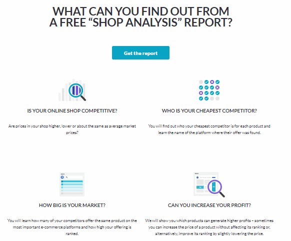
As you can see, there is no art for art’s sake – we get straight to the point. There are four main benefits so that the user can quickly decide whether this service is for them. As you can see, there is also the “get the report” button. It’s called CTA, which stands for a call to action. (remember? Your objective is to encourage the user to take the next step!). In our case, this action is to order a shop analysis report. You can place CTA buttons in many places on your landing page. Typically, marketers put them in the beginning, somewhere in the middle, and at the bottom.
If you operate in the e-commerce market, remember that attractive prices in this sector are always a huge benefit! But that’s why we’re here. If you want to find out how to make your prices more attractive, see our services for online stores.
It is also important to include the so-called in-a-nutshell description. It’s a short description that explains what your product is all about, simultaneously highlighting its crucial benefits.
THE REGISTRATION FORM
Secondly, you have to think about the registration/order form. It’s where you ask the user for their email. You can also directly ask them to place an order via the same form.
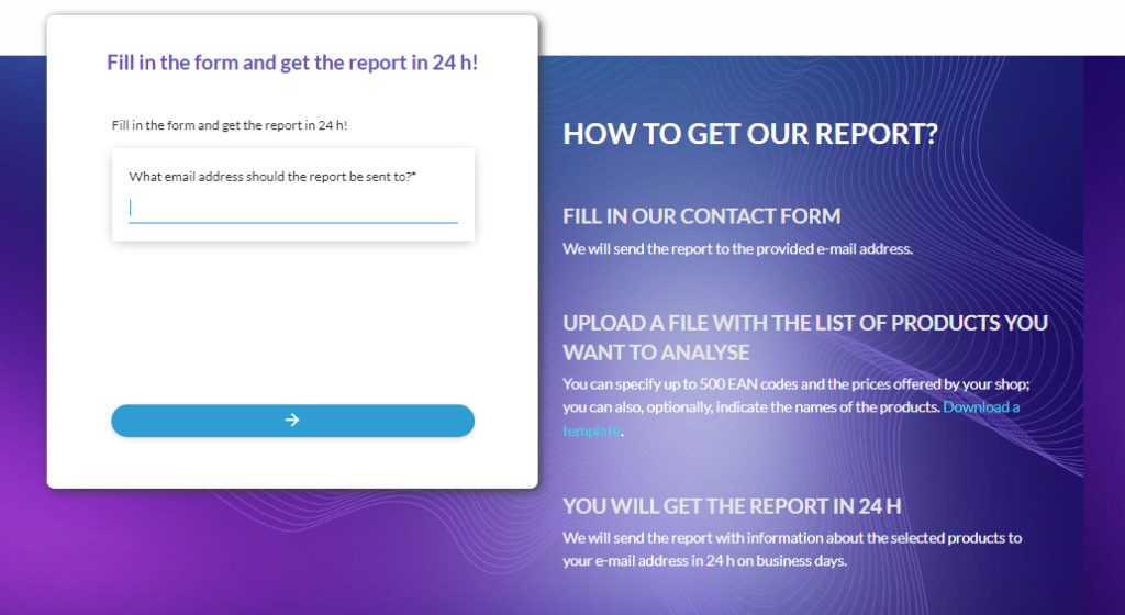
It’s a good place to tell users what will happen next. You can also remind them of the most important benefits. And yes, it’s also a good place to put a CTA button as well.
OTHER ELEMENTS
Landing pages can also have other elements, but they are not mandatory. It all depends on your product/service and your goals. You can think of including:
- Details about different plans/pricing models
- Technical specification
- A place to ask a question/chatbox
- Additional relevant details (e.g., a short FAQ section)
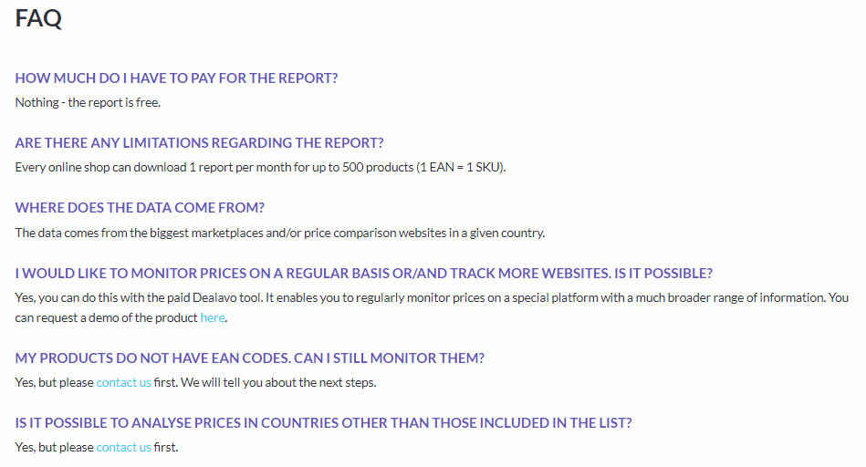
How can you make your LPs effective: Two copywriting techniques
When it comes to landing pages, copy is your best ally. To make your copy compelling and engaging, follow these two copywriting techniques:
AIDA
This abbreviation stands for four stages of customer engagement: Attention->Interest->Desire->Action. First, you need to get potential customers’ attention. Here, you need great ads and social media posts. Of course, the first part of your LP is also responsible for getting attention, don’t neglect it. Next, you have to evoke interest and desire to buy your product – you do that by showing the benefits and critical features of your product. And when that’s done, you have to motivate users to take a specific action. That’s what registration forms and CTA buttons are for.
4Us
Robert W. Bly, in his “The Copywriter’s Handbook” book, presents the 4Us technique that will help you write better copy for your landing page. Write texts that are:
- Urgent (after all, you want your customer to buy now, not in three weeks, right?)
- Unique (emphasize how your offer stands out from the competition)
- Ultra-specific (be consistent, avoid weasel words and generalities)
- Useful (again, it’s all about benefits for the user)
Of course, there are more techniques that you can use, but the most important principle is this: Write with the prospect in mind and put emphasis on benefits.
Let’s take a look at some examples of well-built landing pages.
The best landing page examples
WISE.com
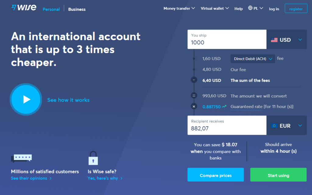
It’s a service that enables you to send money to other countries much cheaper than through banks. As you can see, their LP is all about specifics. Users can easily calculate how much they are going to pay, they can see how the service works and check if it’s safe. That’s pretty much everything you need on a financial landing page, correct?
Shopify.com
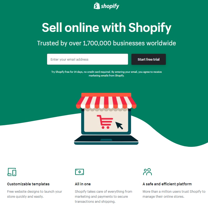
This Canadian e-commerce giant uses landing pages to encourage future online merchants to sell using their platform. They offer a free trial after sending an email address. Everything here is plain and transparent. Users see three main benefits and social proof (trusted by 1.7m+ businesses). That’s what you want on a landing page.
Prices and landing pages
Lastly, don’t forget that an effective pricing policy is a prerequisite for every successful landing page. You can drive traffic to your landing page and attract customers’ attention, but if your prices are inadequate – even a good landing page will not convert. This is where our role begins. Check our services for online stores and for brands, and optimize your prices today. This way, you will be able to create LPs that will attract users with well-tailored prices!