How to display prices in e-commerce: 5 UX best practices
- 03 April 2024
Prices are undoubtedly hugely important in all retail and e-commerce (including online stores and mobile apps). If you want to succeed with your online store, you need to showcase prices in a way that attracts attention and is optimized from the UX standpoint. Let’s have a look at what to pay attention to when displaying prices in your online store; we have five UX best practices that will help you grab your customers’ attention.
Some time ago, JungleScout.com published a study showing the most important factors affecting customer decisions in e-commerce:
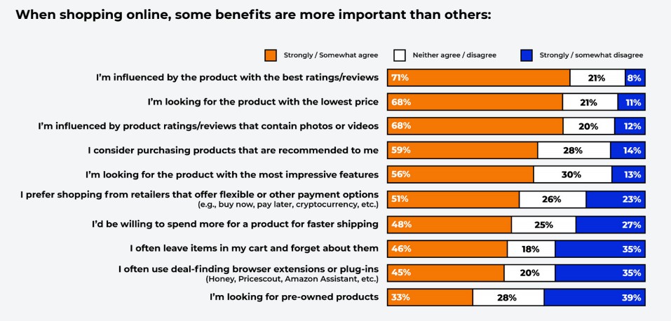
Source: https://www.junglescout.com/blog/reasons-consumers-shop-online/
Unsurprisingly, prices are the second most important factor. Whopping 68% of respondents said they were looking for products with the lowest price. If you run an online store, you surely understand the significance of good prices.
To stay competitive, it helps to go beyond UX and actively monitor what rivals are charging — explore competitive intelligence tools for e-commerce businesses to keep your pricing always one step ahead.
But the truth is that the way those prices are showcased also matters. In fact, it’s a vital part of your store’s UX! Generally speaking, prices should be:
- Specific
- Easy to spot on the product tab
- Attention-grabbing (ideally, they need to stand out from the rest of the product tab)
How can you achieve such a result? There are several UX good practices you need to pay attention to.
Showcasing prices: UX good practices
VISIBILITY AND CLARITY
Ideally, the price should be one of the first few things your potential customers see in the product tab. In all cases, prices should be published above the fold, close to other vital elements, such as the “buy now” button, product title, and product photos.
Here’s a good example of a well-displayed price from Zalando.com:
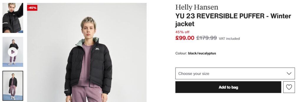
Source: https://www.zalando.co.uk/helly-hansen-winter-jacket-blackeucalyptus-he621u01i-q11.html
Price is displayed above the fold, just under the model’s name. There is also no doubt about the price. Zalando shows the currency that’s adjusted to the customer’s location (it’s a very good solution when running and international store), and there is clear information about the discount. Zalando not only shows the old price (that’s grey and crossed out) but also includes the percentage discount the customer can get.
FULL TRANSPARENCY
Customers hate hidden costs. If your customers find out in the cart section that they need to pay more than you told them in the product tab (for whatever reason), your store’s UX goes down immediately. Be transparent about prices and other involved costs. On the screen above, Zalando mentions that this price has VAT included, so it’s a clear message that it’s the final price the customer will have to pay.
If other costs are involved, e.g., related to shipping, you should list them at the latest in the section where customers can select the preferred delivery method, but not later. They simply need this information in order to make an informed decision on what delivery method to pick.
Beyond UX transparency, brands must also ensure that resellers display prices no lower than the agreed minimum — see our comparison of the best MAP monitoring software for price compliance in 2025 to protect your pricing policy across all channels.
Here, we can show you one bad example where the delivery cost is hidden from the customer until they go to checkout:
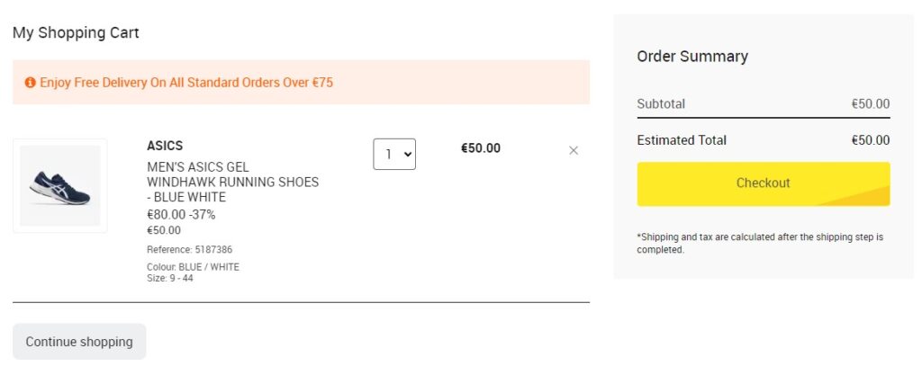
Source: https://www.decathlon.ie/cart?action=show
On the one hand, the customer is being told that the free delivery is only for orders over €75, and „our” order is €50. But on the right side, in the estimated total, we see just the product’s price. When you read the fine print, you will actually see that “Shipping and tax are calculated after the shipping step is completed.” But the store should be more transparent.
For example, what this store could do here is put an estimated delivery cost or say something along the lines of “Delivery from €3” so that the customer can get at least a general idea of how much they’ll have to pay in total.
HIGHLIGHT DISCOUNTS AND SAVINGS
Discounts are powerful sales tools. They can encourage the customer to place an order here and now, so you need to make sure they are clearly visible. Before, we mentioned Zalando as a good example, but take a look at how Leroy Merlin does this:

Source: https://www.leroymerlin.es/
Interestingly, here, the discount is mentioned in three different ways:
- The old price is smaller and crossed out
- The new price is bigger and written in red font
- And there is also an additional box with the percentage savings
And here, LM uses two colors that are usually associated with discounts or great deals – red and yellow. This is a very good example of how you should distinguish all the discounts in your online store.
LEGIBLE FONTS
No one should ever have a hard time trying to read your prices. Here’s another bad example taken from a website with 100% zoom:
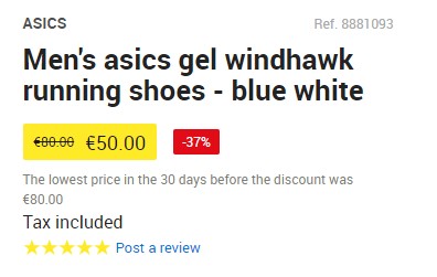
Source: https://www.decathlon.ie/cart?action=show
This way of presenting prices is flawed in two ways. First, the prices are too small, and customers with visual impairments may have trouble seeing them clearly enough. This means they would have to zoom in, which requires additional activity on their part.
And secondly, notice the old, crossed-out price. If you look closer, you will see that the old price was €80, but because of the font issue (also too small and illegible), at the first sight you see €00.00 that’s crossed out, and that’s not a good thing.
Speaking of legible fonts, for web purposes, it’s generally better to use sans-serif fonts that are easier to read.
MOBILE-FRIENDLINESS
Lastly, make sure your prices are adjusted for the mobile screens. Long story short, they should be bigger and clearly formatted so that all customers (pay attention to accessibility best practices!) can see them without any problems.
Take a look at how X-kom.pl, a Polish online store with consumer electronics, does this on the mobile version of their website:
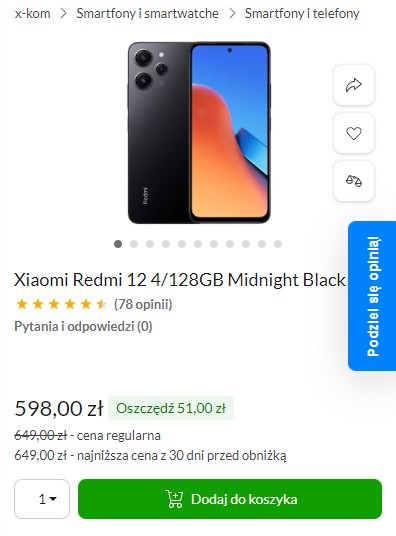
The biggest textual element on this screen is this product’s current price, which makes it clearly visible even on a small smartphone screen. X-Kom also pays attention to other good practices mentioned in this post.
Wrapping up
Pay attention to these elements, and your store will make good use of the way prices are displayed on your website and in your mobile app. If you’re not sure whether a specific solution is good from the UX/UI standpoint, it’s a good idea to consult your design with a trusted UX agency.
UX experts will help you improve not just prices but also other elements of your e-commerce business so that it can grow and retain customers.
If your store sells high-end or luxury products, the way you display prices becomes even more critical — read our guide on premium pricing strategy and examples in e-commerce to see how top brands position price as a quality signal.